

iOS 7 vs iOS 6 - What's The Difference?

The big talking point of iOS 7 is its all-new user interface, led by Apple's head of industrial design, Sir Jony Ive. The iPhone and iPad operating system has ditched the real-world metaphors like torn yellow paper in the Notes app, in favour of a much simpler style; we compare these changes to last year's iOS 6.
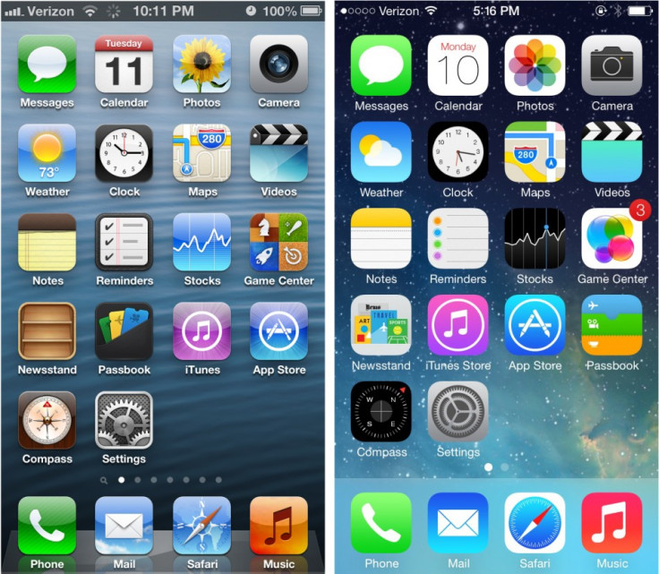
Home Screen
Some of the biggest changes are found on the home screen, where every application icon has been changed to fit the new, simpler and more colourful design. Added to this are changes to the cellular signal strength, dock, menu bar, and wallpaper.
Although flat in terms of colour and texture, iOS 7 is a user interface of many layers. At the back you have the wallpaper, then the home screen icons, followed by the Notification Center and Control Center, before finally pop-up notifications and alerts sitting at the top.
Using the iPhone's accelerometer, Apple has created the illusion of icons sitting above the wallpapers, and tilting the phone lets you peek around them. The animation serves no real purpose, but is distinctly Apple in its ability to draw attention to the simplest of things.
Covering the home screen, Notification and Control centres are semi-transparent, letting the colours of the new app icons (or whatever else is underneath) leak through, adding to the sense of layers stacked on top of each other.
Folders have also been simplified by removing the grey fabric background in favour of the same blurred, semi-transparent effect similar to that of a bathroom window, allowing the general colour of your wallpaper to shine through, but no detail.
Notification Center and Siri
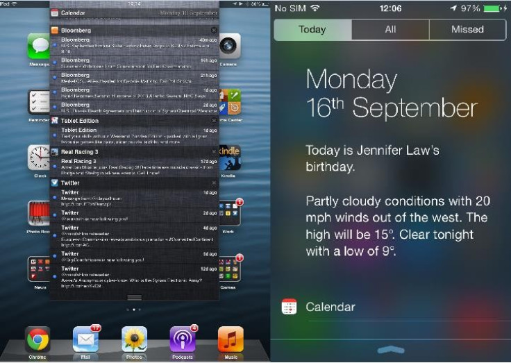
Still found with a swipe down from the top of the screen, Notification Center has undergone a major update for iOS 7. The grey, semi-transparent drawer replaces the fabric design of iOS 6, bringing with it the Helvetica Neue font, found throughout the new operating system.
Gone are the stock ticker and weather widget, replaced with a written description of the local weather forecast, along with a reminder of the next event in your calendar. Scroll down and your calendar is listed in full, followed by a list of stock prices customisable in the Stocks app.
Where in iOS 6 Notification Center was a single page, for iOS 7 there are three; the Today tab, followed by All and Missed, neatly splitting up every notification received across all apps, and anything you've missed since last looking at your phone.
Siri also loses the grey fabric background, replaced by the same semi-transparent effect seen in Notification Center, and where in iOS 6 each message appeared in a chat bubble, your questions and Siri's answers now sit on their own with Siri's input differentiated by a bolder font.
Multitasking
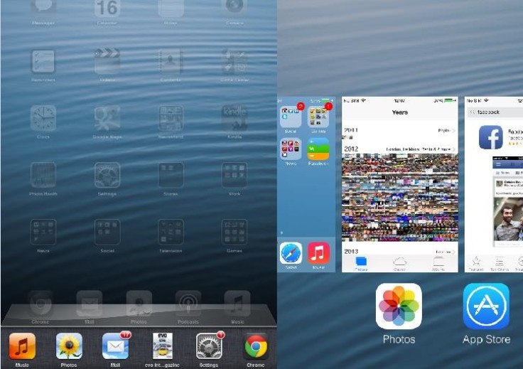
As before, Multitasking is found with a double-press of the Home button, but now the familiar list of open apps is joined by a thumbnail screenshot showing the state it's currently in. Removing these apps from the Multitasking bar - and thus forcing them to close - is now done by swiping the thumbnails up and off the screen; a long press of the app icon is no longer required.
In the background, iOS 7 has a more sophisticated way of multitasking. The system learns when you commonly use applications - weather and a news app when you wake up at 7am, for example - and starts to pre-load the app, updating it ready for you to launch it at the usual time.
Calendar, Settings, Clock, Notes, Music, Newsstand and Phone
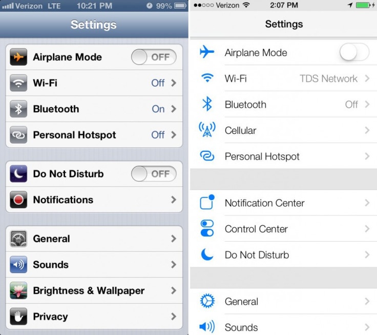
All of these applications share a similar white and transparent design. Applications are no longer topped with a blue bar and icons within apps have all been simplified - in Settings, for example, every icon is now the same shade of blue and there is less shadowing around the on/off toggle switches for Wi-Fi and Bluetooth.
Similarly, the bar of icons at the foot of most applications has been coloured white instead of black or grey, and some icons have been changed. The same goes for the iOS keyboard, which now has white keys instead of grey, and a much lighter grey background than before.
The iOS music player has also received the white-and-flat facelift, dropping semi-transparent black in favour of pure white - a change also seen in the iTunes Store and App Store.
The Calendar app loses its blue menu bars and grey calendar, replaced by a very light shade of grey and white respectively. As with other Apple apps in iOS 7, Calendar uses a reddish-orange as a feature colour used for highlights (such as the current date) and written icons like All, Day, Week and the current year.
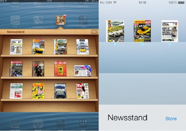
Finally, the iOS Newsstand folder no longer has a wooden bookshelf look to it - instead, iOS 7 offers a very simple design whereby shelves are slightly different shades of whatever colour your Home screen wallpaper is.
Messages
The iOS messaging app also gets the white treatment, replacing the light blue background of all previous builds of iOS, and this time the highlight colour is blue instead of orange. Sent and received messages still show up in green and silver bubbles, but they no longer have a shine to them as they did before - another example of Ive's 'flat' design. The chat bubbles also react to movement in the same way the home screen app icons do. Move your phone and the messages move around slightly, adding to the layered effect mentioned earlier.
Camera
Often criticised for being too basic and offing few of the features available in Windows Phone 8 and Android, the iOS 7 camera app is all-new but still offers few features. Swipe left or right to quickly switch between video, photo, panorama and a new square photo-taking tool, and there are now a number of filters to apply to photos as you take them. It's still basic, and you won't see complex aperture, white balance and metering customisation, but it's a step in the right direction.
There are many more changes in iOS 7 and while users will probably find the OS uncomfortable and unfamiliar at first, every device it's installed on will be given a breath of fresh air, having endured very little cosmetic change over the years.
Read more:
© Copyright IBTimes 2024. All rights reserved.


