

Twitter Tests Redesign that Looks Like Facebook and Google+

Twitter is working on a major redesign on the website that would see a much greater focus put on photos and a move away from its iconic vertical Twitter stream.
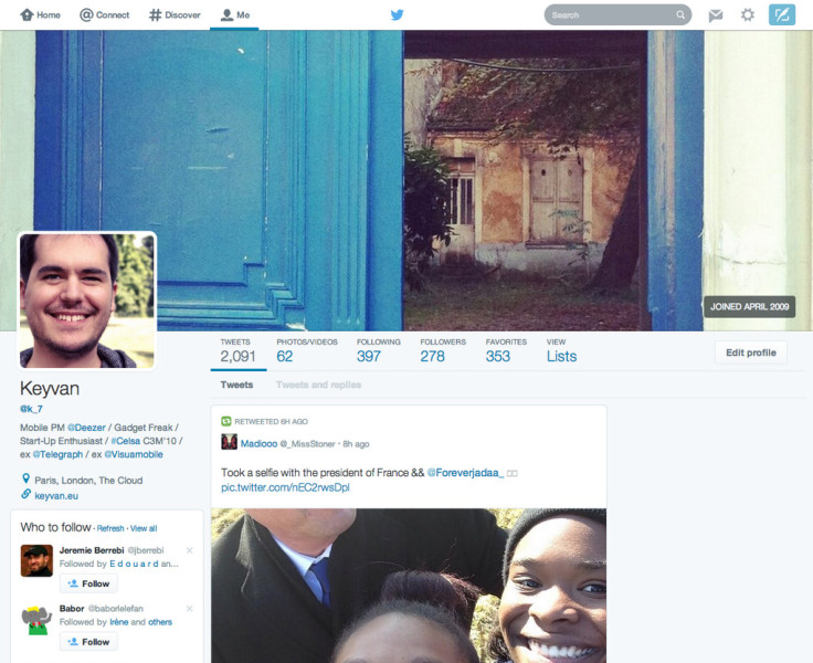
The new design shows the user's profile picture moved to the left-hand side of the screen and a large header photo banner space of 1500x1600 pixels added to the top of the page, similar to the Facebook Timeline.
Instead of the vertical Twitter stream, posts will appear as a grid of updates, with key focus on photos and content posts such as gifs and videos, similar to the current layout of Google+.
The large Twitter background seems to have disappeared, replaced by a uniform grey background, and a row of essential details are placed just under the header, including number of Tweets, number of photos/videos, number of users being followed, number of followers and number of favourites and lists.
Only certain Twitter users have had their profiles updated as part of the test, and there is no indication from Twitter so far as to when the redesign will be rolled out.
You can see examples of what the new layout will look like by following the #NewTwitter stream.
Twitter rolled out a new homepage layout design for users in January, making the homepage on the desktop platform resemble the mobile app version more by placing the cover photo behind the user's profile picture on the left-hand side of the screen, next to the Twitter stream.
Twitter could be aping its competitors and moving away from its original vertical layout, which it has kept since the service started, to try to attract more users to join the service, following the disappointing results of Twitter's first earnings report as a public company, which showed that Twitter's user growth has been shrinking, growing in the last quarter by only nine million users.
© Copyright IBTimes 2024. All rights reserved.


