

Is this what the iPhone 8 apps will look like? Renders suggest a radical redesign is coming
Fan-made renders show how iOS 11 might look on the new iPhone.

The 2017 iPhone, if an image discovered in Apple's own software proves to be accurate, will feature a display which extends to the top and bottom edges of the handset.
At the top, it will even stretch beyond the central speaker, front-facing camera and sensors, while at the other end it will reach below where the home button is currently located. This is, by all accounts, a major change to the iPhone and quite possibly its biggest visual evolution in 10 years.
If this year's handset, expected to be called the iPhone 8, the iPhone X or the iPhone Pro, does indeed get an elongated display, then Apple will have to make changes to its iOS software to accommodate.
These changes will be unique to the 8's version of iOS 11, different to that running on all other iPhones and iPads. This in turn could mean changes to where key controls are located, how the status bar at the top of the phone is displayed, and even how notifications arrive on the screen.
While Apple is yet to reveal, or accidentally leak, any of this information, we must turn to the ever-faithful render designers.
These fans have earned a reputation for envisioning what Apple's future products will look like, and this time it's the turn of Max Rudberg, who has published several examples of what the iPhone 8 might look like on his blog.
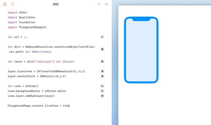
The renders are based on the below image, which was found buried within the firmware of Apple's upcoming HomePod smart speaker, which was recently distributed to developers earlier than intended.
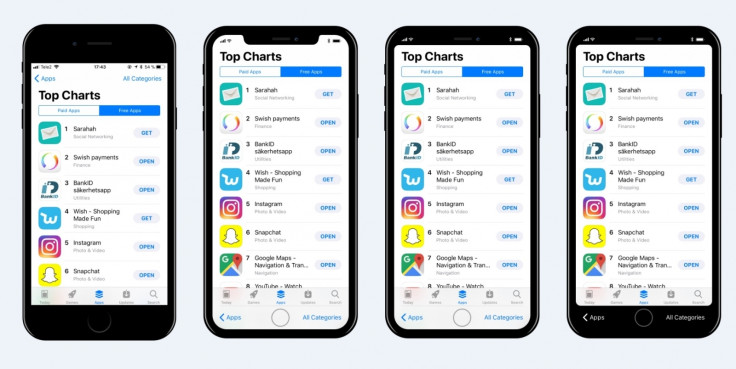
Working from left to right on the image leading this article, the first shows how the iPhone looks today. The second shows how the user interface could work around the 'notch' created by the screen splitting around the speaker, camera and sensors. Note here, and in the next two renders, how the app navigation controls (in this case Apps and All Categories) have moved from the top of the screen to the bottom, making them much easier to reach when holding the phone one-handed.
The third render colours the top of the screen in black, making the display seem like it is rectangular, rather than split around the notch. The final render applies a similar style to the foot of the display, putting the navigation buttons on a black background. This is a similar look to the Touch Bar of the current MacBook Pro lineup, which blends virtual keys and icons on a display into the black physical keyboard below.
Although blending the top and bottom with the handset might seem like a neat option, Rudberg observes how it makes the rest of the display seem smaller. "Beforehand I was fond of the idea of blending the status bar with the hardware, but seeing the mockups like this, I'm not so sure. Blending the status bar with the hardware makes the screen seem smaller than it is and the result is less striking. I'm now leaning towards that Apple will embrace the notch."
© Copyright IBTimes 2024. All rights reserved.


