YouTube's desktop site gets Material Design and dark theme
A preview version of the new look is now available to a small group of users.
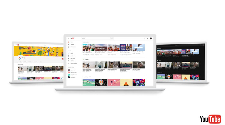
YouTube is redesigning its desktop site with key features including Android's Material Design interface, which users have been waiting for a long time.
Google's video sharing site has been testing the Material Design feature that aims to deliver intuitive user experience since a year now.
One of the highlights of the redesigned version is Dark Theme that cuts down the glare and turns the background dark throughout the YouTube site.
The new design is based on a faster framework called Polymer that enables quicker feature development.
Brian Marquardt, Product Manager at YouTube in a blog post on 2 May said the new design is clean and fresh, and it removes all the visuals that distract user from browsing and watching. Additionally, the design is aligned across Google platforms including mobile app.
Along with offering a sneak peek at the new look YouTube has also made the preview of the new design available to a small group of people to get feedback, before the wider rollout.
Those who wish to get their hands on the latest look can opt-in to the preview at youtube.com/new. After trying the design, you can always return to the current version by selecting "restore classic YouTube from the Account menu.
© Copyright IBTimes 2025. All rights reserved.
- MOST READ