DHS Faces Outcry Over Alleged Use Of 'Nazi-Style' Typography In Official Posts
Critics accuse DHS of evoking authoritarian iconography in its recruitment and public messaging.

The United States Department of Homeland Security (DHS) is confronting an intensifying backlash after critics alleged that graphic design choices in official social media posts, including typography, evoke authoritarian, 'Nazi-style' visual language.
The allegations have triggered a fierce debate among historians, design experts, and lawmakers about the implications of government communications that some say echo extremist aesthetics.
The controversy centres on a series of recruitment calls from the official @DHSgov account on X (formerly Twitter).
The posts feature bold, Old English-inspired Blackletter typography—a style historically associated with early 20th-century European propaganda—alongside slogans such as 'Protect. Serve. Deport.' and ominous warnings that 'America has been invaded by criminals.'
While the agency has dismissed the criticism as an 'overreaction,' the Southern Poverty Law Centre (SPLC) recently documented that these recruitment materials disproportionately depict racialised communities in 'upsetting ways' while using imagery common in neo-Nazi circles.
Criticism Mounts Over Visual Messaging
Graphic designers and typographers have stepped into the debate to explain why the visual choices are causing such alarm.
The typography used in these posts, characterised by ornate serifs and dramatic letterforms, resembles what is broadly known as Blackletter or Old English script, a style that has historical associations with early Nazi propaganda, even though it was later banned by the regime in 1941 as 'too old-world' and tied (inaccurately) to Jewish printing traditions.
Social media users began drawing attention to posts from the official DHS account on X (formerly Twitter) that feature bold, Old English-inspired typography alongside recruitment calls and national security messaging.
One widely shared post, flagged by commentator DarrigoMelanie on X, showcased this typeface in imagery that critics described as reminiscent of historically loaded fonts used in early 20th-century European propaganda.
They’re using the Nazi font now, because using Nazi slogans wasn’t enough.
— Melanie D'Arrigo (@DarrigoMelanie) January 13, 2026
Republicans will say “they’re trolling” —but who trolls people by pretending to be, and acting like, Nazis?
This isn’t trolling.
This is just another mask off moment. pic.twitter.com/wtsBhZoHtc
Khara Cloutier, a typography instructor at California Institute of the Arts, said that the comparison to Nazi aesthetic is 'absolutely relevant', given the stylistic lineage of Blackletter forms.
Critics argue that when paired with cinematic videos of Immigration and Customs Enforcement (ICE) agents, the 'nostalgic' and 'authoritarian' tone of the font choice becomes a deliberate dog-whistle to the far-right.
“Blessed are the peacemakers, for they shall be called sons of God.” - Matthew 5:9 pic.twitter.com/MtRv7DpzHA
— Homeland Security (@DHSgov) January 13, 2026
Such visual choices have resonated powerfully in the heated political context of the United States, not least because DHS posts are often coupled with cinematic videos of Immigration and Customs Enforcement (ICE) agents.
Experts Weigh Historical and Cultural Implications
Historians and cultural scholars emphasise that typography carries connotations shaped by decades of visual history. Records indicate that Blackletter scripts were standard in German books and documents long before the Third Reich and were later appropriated in early Nazi propaganda.
Nazi German font, too, just in case anybody missed the message pic.twitter.com/EsULf6sXLm
— Andrei A Dioumaev (@ADioumaev) November 22, 2025
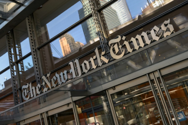
Nevertheless, given their entwined history, the use of such fonts in government communications invites scrutiny. It's also important to note that while the Old English aesthetic can be found in newspapers like The New York Times masthead, in marketing and pop culture, it also appears in extremist contexts, including neo-Nazi platforms, meaning public institutions must consider how typography might be interpreted.
The Southern Poverty Law Centre's Hatewatch Project has independently documented other aspects of DHS's social media strategy that it regards as troubling. Its analysis found government posts and recruitment materials that incorporate slogans and imagery originating from extremist sources and disproportionately depict racialised communities in upsetting ways, raising alarms about racialisation and symbolic messaging in official content.
This form of Blackletter isn’t the “Nazi Font”. It’s more akin to Old English Blackletter. The Nazis preferred to use Deutsche Schrift and Fraktur: pic.twitter.com/JVEOjh1kED
— Bert Swattermain (@BertSwattermain) January 14, 2026
Political Ramifications
DHS leadership has so far offered limited direct comment on the typography controversy. A spokesperson has previously dismissed similar criticisms of stylistic choices as overreactions by social media commentators, asserting that visual experimentation is a part of evolving government communications.
When questioned about a video featuring MGMT's 'Little Dark Age,' a song adopted by far-right content creators, DHS responded: 'Go outside, touch grass, and get a grip.'
In an earlier statement reported by NPR, DHS said: 'This administration is unapologetically proud of American history and American heritage. Get used to it.'
Heidi Beirich, co-founder of the Global Project Against Hate and Extremism, argues the cumulative effect of the imagery is concerning. The posts, she told NPR, conjure a narrative that 'we had a wonderful white civilisation and culture that has been decimated by these people who don't belong here, who just happen to not be white people for the most part'.
The debate reflects deeper tensions over how federal agencies communicate in an era of charged political imagery and what constitutes appropriate visual language for democratic institutions.
DHS's critics and defenders are not monolithic. Some media commentators argue that invoking claims of 'Nazi-style means nothing' if critics dislike the policy message, suggesting that emphasising form over substance can distract from substantive debate over immigration and enforcement priorities.
Nevertheless, the rapid spread of examples sparked by the original X post has amplified scrutiny, driving academic and legal commentary about what constitutes appropriate government messaging in a democratic society.
As DHS continues to navigate its public role, the dispute underscores a simple but potent truth: in the digital age, how government looks can matter almost as much as what it says.
© Copyright IBTimes 2025. All rights reserved.
- MOST POPULAR IN World