Why has Uber changed its logo? Users complain of taxi app dramatic redesign

If you go to use your Uber app today you'll be in for a surprise, as the taxi-hailing app has decided to ditch its recognisable logo in favour of a new design – and people are not happy about it.
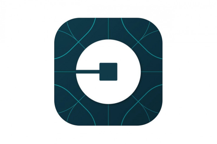
In a bid to shake up its look and bring a more personal appeal that relates to markets around the world, the new logo is radically different and comes as a surprise for as a company on the rise will not often drastically change its branding.

Gone is Uber's iconic 'U' design– instead the company has literally turned things on its head with a circular shape that looks more like padlock or backwards 'C' than anything you'd associate with Uber.
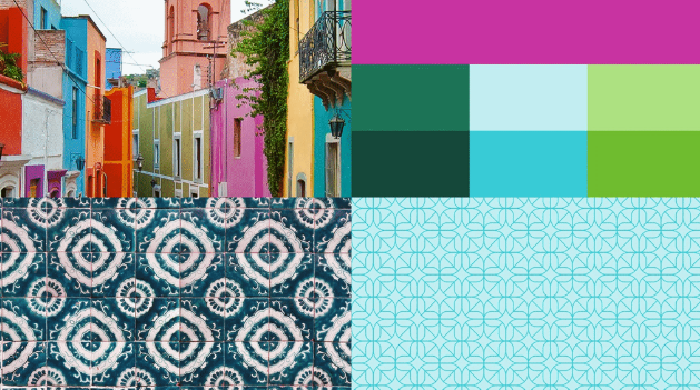
"The old Uber was black and white, somewhat distant and cold," explained Travis Kalanick, CEO and co-founder of Uber. To add a more human element to its app Uber has decided to make a different logo for each of the country it operates in, bringing in cultural influences of colour and local design.
"In Mexico, we were inspired by Mexican pink and the patterns in the local tiles; in Ireland, from the Georgian architecture and the lush greens; and in Nigeria, from the ankara, which came up again and again because of its bright colours and beautiful geometric patterns."
The Uber blog gave examples of the mood boards it worked with when designing each country;s individual logo.


Every city has its own character and Uber's long-term goal is to have unique designs for cities as well as countries. This will mean adding hundreds more colour palettes and patterns over time.
New Uber logo outrage
However, it seems not everybody likes the changes, with users complaining of the new logo looking like everything from a USB cable to an eyeball, Pac-Man and a bodypart we cannot mention – a far cry from the straight-forward, slick design of old.
Can someone explain what the new #Uber logo is supposed to represent? It looks like a USB cable to me.
— Ahmed Aboulnaga (@Ahmed_Aboulnaga) February 3, 2016
It's like #pacman is uber ? EATING UP ALL THEM CABBIES ? #londoncab vs #uber #too #political #for #a #wednesday pic.twitter.com/a3GwytrZcs
— TheMichaelJay (@the_michaeljay) February 3, 2016
total first world problem but major #fail on the new Uber logo
— Mike Shemesh (@MikeShemesh) February 3, 2016
The new @Uber logo is UGLY!!!
— ⚡️Adam (@adamduplooy) February 3, 2016
It's rumoured that Kalanick had a large role in the design of the new logo, which might explain its more clunky look (visions of Kalanick doodling in front of nervous designers spring to mind) but even if the new logo looks more like something from a software security start-up than international taxi company we very much doubt it'll damage Uber's surge. It might confuse a few people who go to their phone looking to grab a cab after a night on the tiles though.
© Copyright IBTimes 2025. All rights reserved.


