'What Is This Ugly App?' Spotify's Disco-Ball Icon Sparks Fury: 'It's Temporary' And Will 'Go Away Next Week'
Users react strongly to Spotify's temporary icon change for its 20th anniversary.
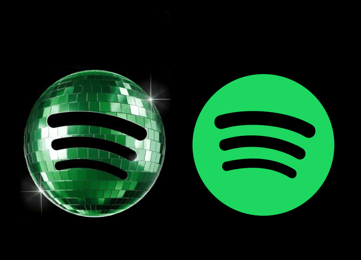
Spotify users opened their phones expecting music and got a glittering green disco ball instead. The reaction was swift, oddly furious and impossible for the streaming giant to ignore.
The temporary icon change, introduced as part of Spotify's 20th anniversary celebrations, has triggered a flood of complaints across social media, with users attacking everything from the colour palette to the logo's readability. Spotify, clearly aware the backlash snowballed faster than anticipated, has now confirmed the original app icon will return next week.
A Birthday Celebration That Quickly Turned Sour
The glowing mirrorball icon appeared without much warning on Apple iOS devices last week. Spotify intended it as a playful nod to its 'Spotify 20: Your Party of the Year(s)' campaign, an in-app retrospective encouraging users to revisit old listening habits and music milestones from the platform's past two decades.
Instead, many users treated the update like a personal insult.
'The person who designed this logo should be fired,' one user posted on X alongside a screenshot of the altered icon. Spotify's official account responded with unusual defensiveness mixed with corporate humour, replying: 'We know glitter is not for everyone. Our temp glow up ends soon. Your regularly scheduled Spotify icon returns next week.'
Another frustrated user wrote: 'This new update of Spotify what the hell is this ugly app??'
Again, Spotify leaned into the joke rather than challenge the criticism directly. 'Our birthday icon was a limited-time guest star. Your regularly scheduled Spotify icon resumes soon.'
The company's responses suggest it always planned for the icon to be temporary. Yet the scale of irritation caught attention because the change itself was relatively minor. Spotify did not redesign the app's interface, pricing or functionality. It altered a small square image on users' home screens.
Why People Became Weirdly Angry
App icons occupy strange psychological territory. They are branding, habit and muscle memory rolled into one. Millions of people locate Spotify instinctively through the familiar green-and-black logo without consciously thinking about it.
Change that visual cue, even briefly, and users notice immediately.
Marketing consultant Jack Appleby argued the redesign suffered from 'huge readability & brand issues', criticising the darker green colouring and what he described as a pixelated disco-ball texture that looked messy on smaller phone screens.
He called it 'a kinda dumb mistake'.
Spotify's reply was notably light-hearted but also revealing. 'It's our birthday so we're in our party gear, but we'll be back to normal when the lights go down.'
The company clearly hoped the icon would come across as celebratory and playful. Instead, many users interpreted it as visual clutter. The backlash exposed something digital brands often underestimate. Familiarity matters more than creativity once a platform becomes embedded in daily routine.
That tension is especially sharp for Spotify because its identity is already visually minimal. The green circle and curved black lines are instantly recognisable in a crowded app ecosystem. Altering that simplicity risks confusing the very recognition the brand spent years building.
Not Everyone Wants Safe Branding
Still, not everybody hated the disco ball.
Michael J. Miraflor, global executive vice-president of client services and strategic planning at WPP's EssenceMediacom, defended Spotify and criticised what he viewed as an overreaction from users online.
'Look what you've done, dorks,' he wrote on X. 'You've bullied Spotify into reversing something fun and different.'
His point landed with some marketing professionals who argue tech platforms have become too cautious and visually sterile. Temporary branding experiments, even clumsy ones, at least inject personality into products that increasingly look interchangeable.
Streaming companies are under constant pressure to keep users engaged beyond simply playing music. Anniversary campaigns, nostalgia features and visual gimmicks have become part of the retention strategy across the tech industry. Spotify's birthday campaign was designed to generate conversation and social sharing. In that sense, it worked exceptionally well.
Spotify's Icon Will Soon Return To Normal
Spotify has now repeatedly reassured users that the disco-ball icon was always temporary and will disappear next week. The company has not indicated whether the backlash influenced the timing or whether the original plan remains unchanged.
Either way, the episode became an unexpectedly vivid reminder of how emotionally invested people are in tiny details of digital life. A small logo adjustment generated more online outrage than many substantial app updates ever received.
For Spotify, the stakes were low. No subscriptions were cancelled en masse. The platform remains dominant in music streaming.
© Copyright IBTimes 2025. All rights reserved.
- Recommended For You